From creating a map in eight minutes to creating market predictions based on streamlined analysis.
Among the many mapping programs available, CartoDB stands out for its ease of use and sophistication. It allows users to import and display datasets in 12 different formats, including Esri shapefiles, Google Earth’s format, Excel spreadsheets, and Open Street Map dumps.
Beginners can then style their maps using user-friendly wizards, while advanced users can do so using the CartoCSS syntax language. Beginners can also use drop-down menus to perform such operations as merging datasets and adding layers, while advanced users can write SQL queries.
A data library gives all users access to 160 free, public domain datasets. A free subscription allows for four layers, unlimited views, and unlimited datasets up to a total 250MB of vector data; paid subscriptions offer more layers and storage, as well as private maps.
All users have access to the software’s documentation, two-dozen tutorials, and more than a dozen case studies and can get answers to technical questions through a large community of open-source developers. Paid users also have access to technical support directly from CartoDB.
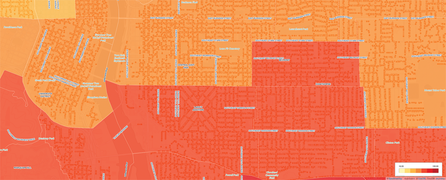
View of an area of the map at zoom level 15.
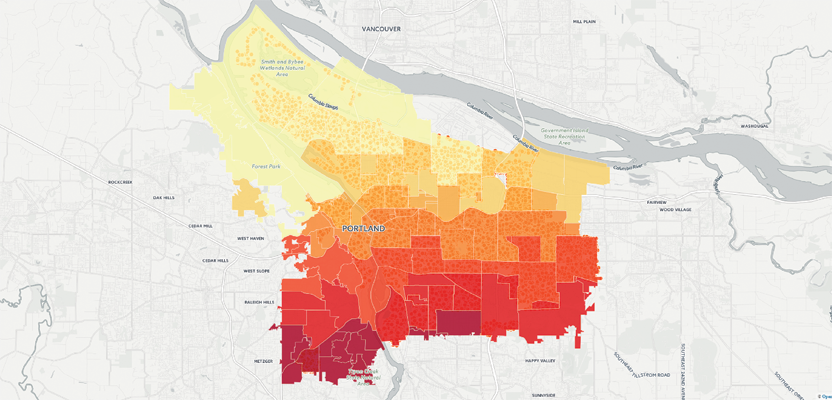
I generated this choropleth map, showing the distribution of about 160,000 street trees in Portland, Oregon’s 95 neighborhoods, in just eight minutes and three steps. (Of course, that was after I had already researched where to find the data I needed, set up a CartoDB account, and spent a few hours learning how to use it.)
Here are my three steps.
- I searched for a dataset of trees (points) and one of neighborhood boundaries (polygons) on www.civicapps.org and downloaded them to my computer (this took less than two minutes).
- I uploaded the two datasets to CartoDB (this took four minutes).
- I opened one dataset, visualized it, then added the other dataset as a layer; then I created a choropleth map using a wizard (this took two minutes).
The trees dataset was created by the Portland Bureau of Parks & Recreation’s Urban Forestry division, and the neighborhood boundaries dataset was created by the Portland Bureau of Technology Services.
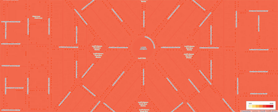
View of an area of the map at zoom level 18.
I discussed CartoDB’s origins, mission, and market strategy with Santiago Giraldo, senior technical evangelist at the company.
What are your company’s origins?
CartoDB was founded by a group of environmental scientists and climate researchers in Madrid. They found that the tools available needed to be improved upon so that they could more effectively and rapidly process, analyze, and visualize large volumes of data.
Using leading open-source technology, we built a location intelligence platform, called CartoDB. Its capabilities revolutionized our workflows, and we very quickly saw our technology having an impact across many professional fields—including business intelligence, smart cities, and research.
Once the company was launched and we were able to see its value across the board for many different uses outside of environmental research, we moved to New York City, where we are now based.
Who are some of your largest users?
In the “smart cities” realm, the City of New York uses CartoDB in many capacities, from internal operations to citizen-facing dashboards, and Mexico City has undertaken one of the largest and most comprehensive inter-agency data communication and analysis use-cases. We have partnered with such companies as Telefonica and AppGeo. AppGeo’s application, MapGeo, serves more than 100 cities in the United States.
Other areas in which we are seeing some of the most important projects emerge are financial services and investment analysis and business intelligence.
What kinds of new users or applications do you target?
Our target users are anybody in business, finance, and retail—from data analysts to financial consultants—who are trying to get the most of out of their location intelligence or analyze it in new ways.
While CartoDB allows anyone, even without technical experience, to explore and discover visual insight from complex data, we often find that the best place to deliver value is through integration into existing workflows and applications. Our platform is built to allow developers quick integration through a suite of APIs, as well as our JavaScript library, CartoDB.js, that effectively lets you work with, analyze, design, and integrate your data and CartoDB.
Most of our users use the platform internally, for analytics and predictive analysis, to better understand their operations and optimize their processes. We also work with different data portals to integrate an “Open In CartoDB” button.
For example, Data.gov has integrated that button into its Web site. Instead of just looking at broad data on Data.gov, with one click of a button they can open it and visualize it in CartoDB pretty much instantly.
The most interesting and useful application of our technology we’ve seen is through streamlining both data visualization and geo-analytics together. This combination allows for streamlined analysis-based prediction of where things will happen. For example, CartoDB enables distributors and merchants to determine the best location for new distribution centers or retail locations and helps companies predict where new markets will emerge.
CartoDB can be augmented with other Open Source solutions for handling big raster data sets.
What assistance do you provide to new users?
A very good place to start to learn to use CartoDB is our CartoDB Academy. Our wizards allow you to visualize and understand your data in different ways. Our choropleth option allows you to visualize concentrations of things of the same type, and our categorical option allows you to see where concentrations of different types of things are happening. One of my favorite applications is using crime data to see where pockets of crime actually exist.
If your data has time stamps, you can visualize it over time using Torque, see where concentrations are emerging over time, and see them categorically over time.
How can users access your repository of georeferenced data?
Many of our users have their own data that they need to analyze and visualize. We enable them to do that, in real time, using CartoDB right out of the box.
We also have a data library, with many data sets that you can access with any CartoDB account. In addition to that, we are working on our Data Observatory, which will actually be a very comprehensive data offering that essentially will allow users to analyze data on a more granular level through a wide array of in-house data.