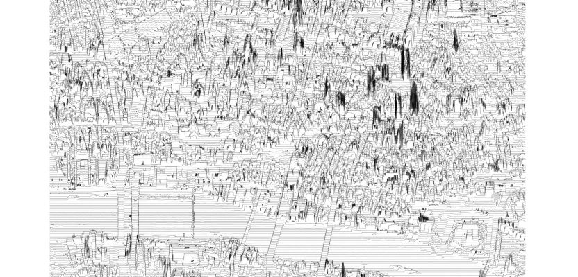
In July 2014, a developer and neocartographer from Scotland created the “Joy Divionesque 3D Map.” This began a four-year onslaught of maps that replicate the style of the iconic Joy Division album cover, “Unknown Pleasures.”

How does it work? Essentially the elevation is taken from an underlying terrain or digital surface map as points, which are then rotated so the elevation aspect is upwards (in the y direction). This is then converted to lines.
In this blog I’ll show you how to make one of these maps yourself using QGIS.
Steps
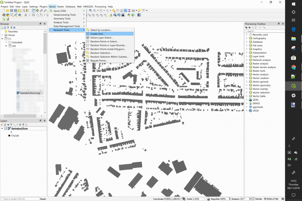
- Add a terrain raster or surface raster to your project. The higher the resolution, the better the troughs and peaks of your line. For this I am using a 25cm DSM of Swindon.
- Next, open the vector tab and go to “Research Tools,” then select “Create Grid.”
- Use the raster layer extent for the size of the grid, and then you want the horizontal spacing to be the same as your raster cell size (for me it is 25cm). Set your vertical spacing to something like 10 – 20m.
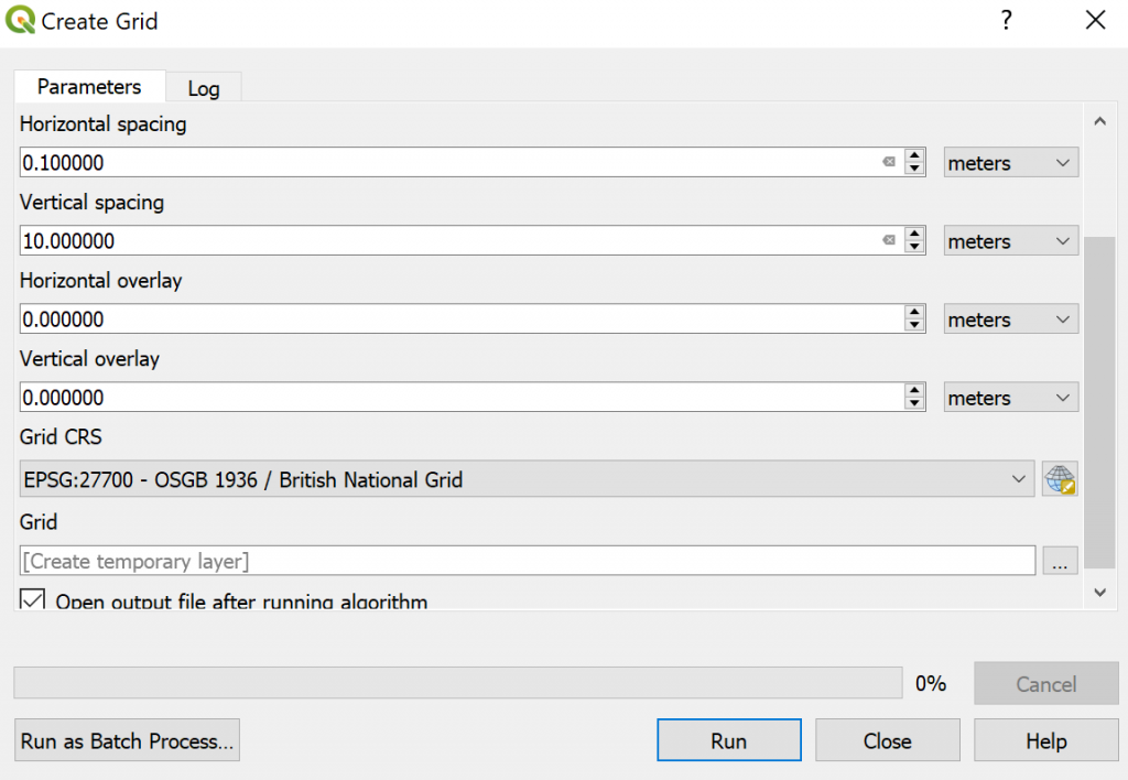
- Run the process.
- Go to the geoprocessing toolbox and select the “Translate” process.
![]()
- Set the grid as you did the input data, then we apply the “rotation” to the height by selecting the edit option on the y-axis offset field.
![]() 7. We then use the following: raster_value(‘RASTER LAYER NAME’,1,$geometry) to apply the rotation. In the example below, my raster is called “Swindon25cm.”
7. We then use the following: raster_value(‘RASTER LAYER NAME’,1,$geometry) to apply the rotation. In the example below, my raster is called “Swindon25cm.”
![]()
8. Run the process
9. The last step is to convert those points to lines for that authentic look, so in the processing toolbox, look up the “Points to Path” tool.
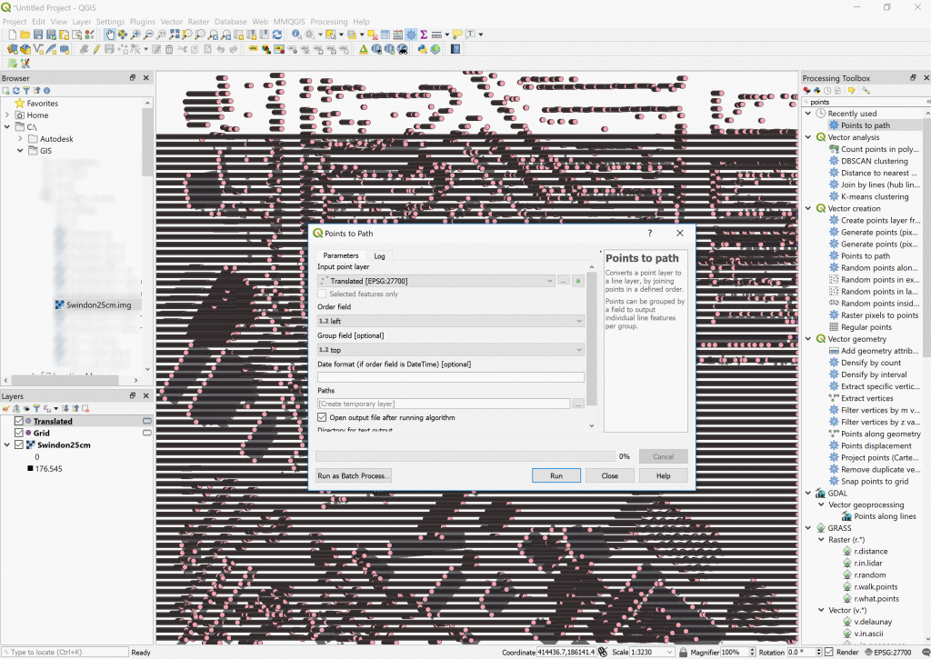
10. Use the “left” as your order field and “top” as your group fields.
11. You should have an awesome result!
My Result
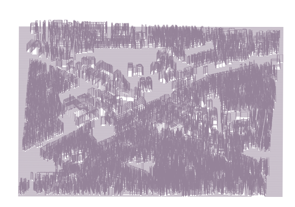
So, mine didn’t really turn out that well. I’ve got to be honest, I chose to use a cityscape, as the London one I did turned out really well; see below:
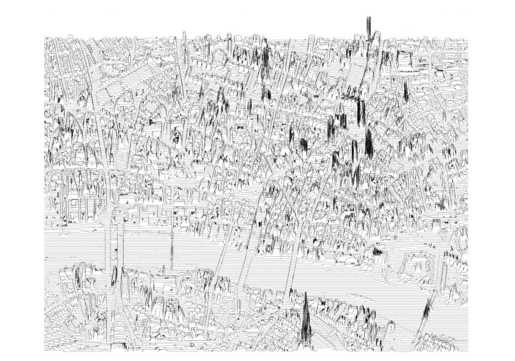
If you really want to create that authentic Joy Division look, though, you are best using a nice hilly terrain, and hopefully you will get something like the map below. The only thing missing is inverting the colors!
After I wrote this blog, I realized that there is another way of doing the same process. Rather than running the translate tool to take the geometry and rotate it, you can use the “point sampling” tool to take the heights (from the raster) and put them into the points. Then, in the translate tool you only need it to use the “rvalue” field (in the points) with the values you’ve added. I’m not sure it is any faster, but it is an alternative if you struggle with the expression.