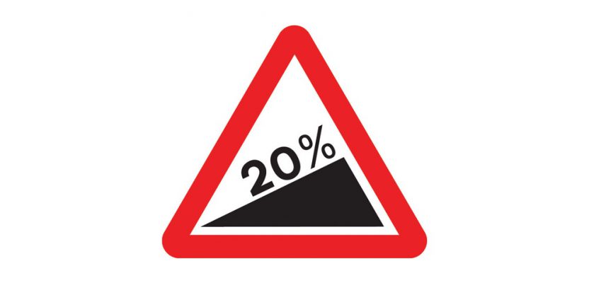
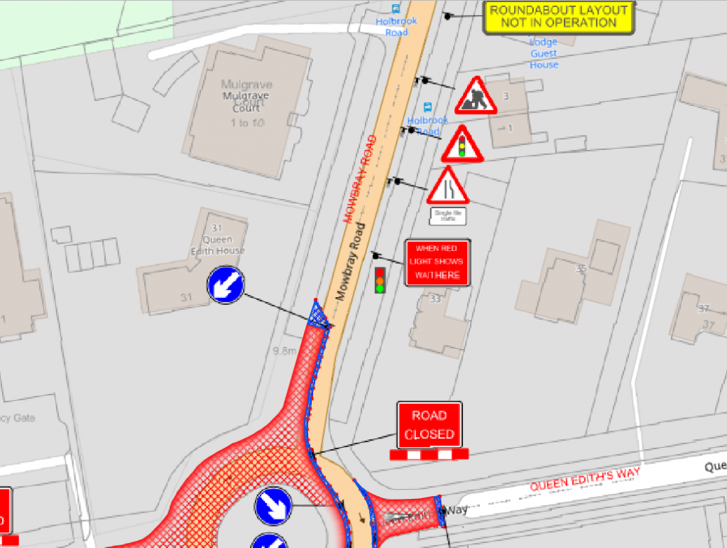
At the moment, I am doing a little work with the construction industry that requires road signs and markings placed on a map to show where signs need to move as the site(s) moves through different phases. Now, a real cartographer nerd would say that good graphics and symbolization would negate the need for placing realistic-looking signs. Unfortunately, fat fingers and the need for quick understanding mean that realistic-looking road signs are a huge help. So, my last few days have been spent drawing up road signs and placing them in a map … until I spotted something quite odd but ultimately awesome.
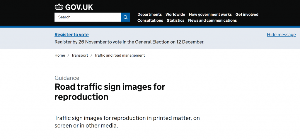
The UK government shares all their road signs as EPS and PNG data HERE!
(Since writing this, I found the United States road signs in SVG format HERE,)
UK Road Traffic Sign History
For those with an interest, the system currently in use was mainly developed in the late 1950s and the early 1960s, with additional color-coding introduced in the mid-1980s. There were three major steps in the development of the system.
- The Anderson Committee (1957) established the motorway signing system.
- The Worboys Committee (1963) reformed signing for existing all-purpose roads
- The Guildford Rules (mid ’80s) introduced features to indicate different categories of route.
The UK has a complex and detailed set of guidelines on how the road signs should be created, and this, in part, is the reason the images have been made available; it is important that representations of the signs, where displayed, are correct. And there is less risk by making them available than there is of them being (incorrectly) reproduced. You can see this on the page where they are provided: the text specifically requires that they are “reproduced accurately.”
Now, my initial excitement over finding these road signs was immediately wiped out when I found that there was over 600 of them. If you’re using ArcGIS or ArcGIS Pro, then using the png format files isn’t an issue because the Esri software loves image marker symbols and you can pretty much just point your data at the required png file and away you go. If you’re using QGIS, I found it isn’t quite as easy, so I thought I’d outline the journey to get them drawing.
How to Get the Signs
The first step is to obtain SVG format files from the EPS files. There are a couple of open source options available using the open source solution Inkscape (which is an excellent tool for vector drawing and manipulation), but at time of writing, I have spent three hours rewriting the code, and it would appear that the scripts provided in the tutorials do not work with SVG formats.
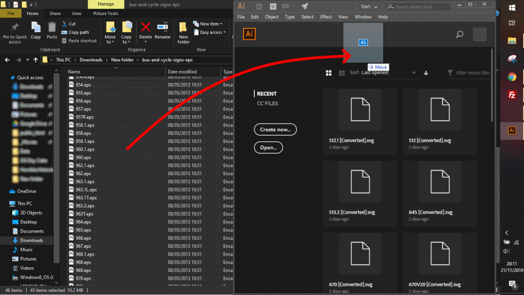
Select EPS files, then drag into Illustrator
Therefore, I used Adobe Illustrator. If you drag and drop a folder of EPS files into Illustrator, you can go to the file menu and then go to “scripts.” This gives you the option to convert the openDoc to SVG. Select your output folder and you can convert over 100 EPS files at a time over to SVG.
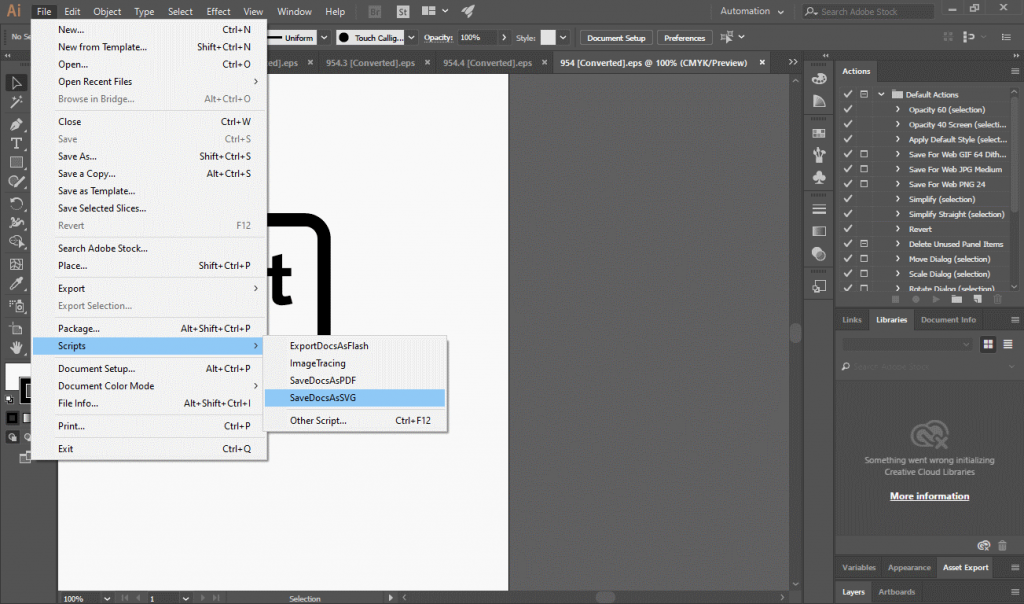
Use the Doc to SVG tool to convert all the open images
The second step is to add those SVG files to QGIS.
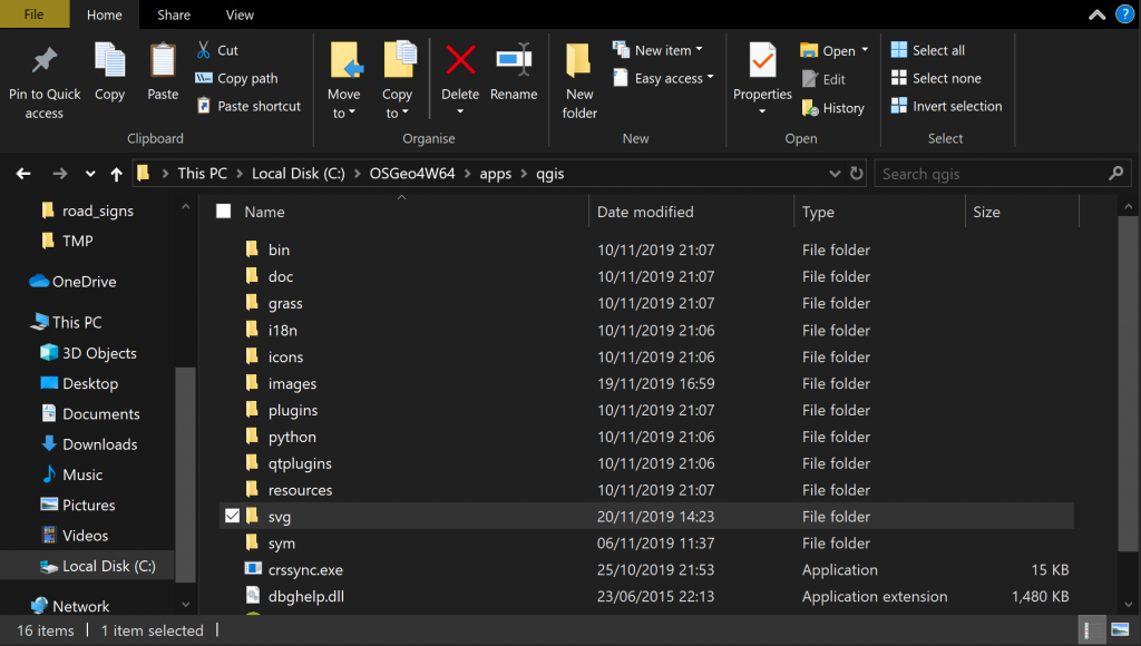
Navigate to the QGIS folder
As long as you maintain your folder structure from the download, you can just drag and drop all the SVG files into C:\OSGeo4W64\apps\qgis\svg if you are running windows and the OSGeo4W version of QGIS. If you are running the Windows download version (from QGIS.org), you will find the folder in the Program Files folder under the SVG folder.
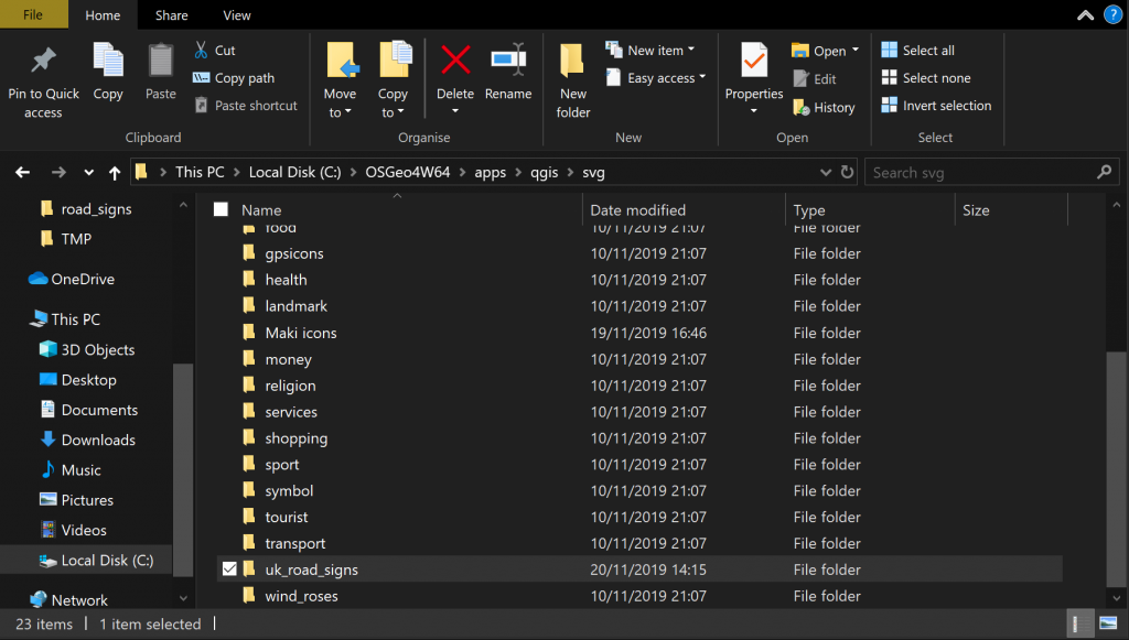
Once there are copied all in, you can restart QGIS and then go to your symbols, and you will find them all in your SVG Markers!
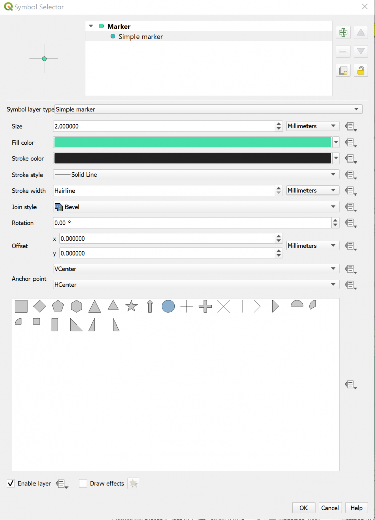
Go to symbology and click on the “simple marker”
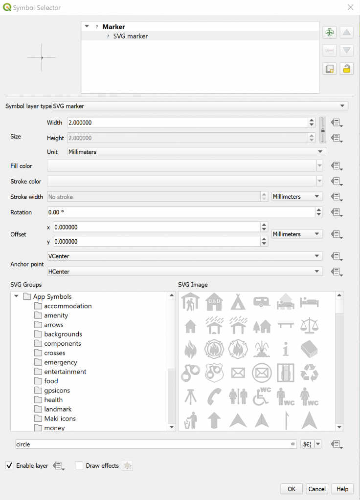
Change to SVG marker and all your cool icons will be available
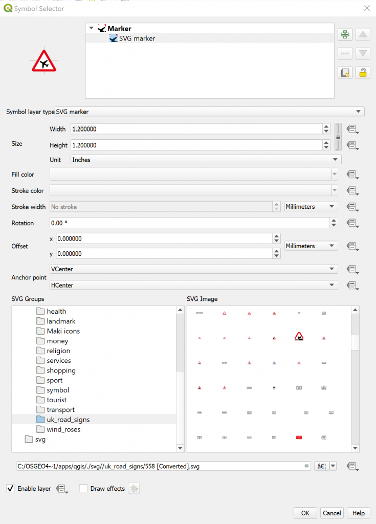
Navigate down to the name of your SVG folder
Voila!
Go and play!