Digital mapping has boomed during the COVID-19 pandemic. From tracking cases to allocating vaccines, GIS technology is at the frontline of the war to beat the virus.
“I recall hearing news stories about an outbreak of pneumonia-like symptoms in Wuhan,” says Nicholas Stewart, a geospatial scientist, describing the first time he heard about the COVID-19 disease around the middle of January 2020.
From the moment when the earliest case in the U.S. was reported, the illness caused by the SARS-CoV-2 coronavirus spread quickly and soon became a pandemic. COVID-19 has infected more than 170 million people in at least 200 countries, while the loss of human lives has reached 3.5 million and counting.
But like most people a year ago, Stewart did not imagine the magnitude of the situation.

Nicholas Stewart, senior research scientist at Surgo Ventures, leads the company’s geospatial analytics initiatives by combining GIS and AI.
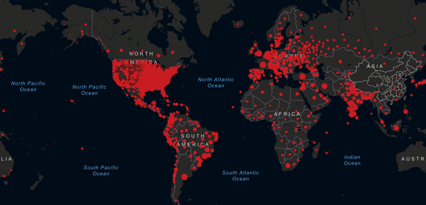
“It wasn’t until I saw the Johns Hopkins COVID-19 dashboard for the first time that I realized the severity of the spread of this disease,” says Stewart. As an analyst who holds a doctorate in Geosciences and Remote Sensing, he crunches data for a living and transforms them into visual information. So viewing the extent of the COVID-19 disease on a map made perfect sense to him.
“Seeing those red dots populating the dashboard screen really had a powerful effect on me.”
If, like Stewart, you were following the news on the COVID-19 situation during the first weeks of the pandemic, you may have also seen the Johns Hopkins dashboard featured in various television and online media outlets. The popular online dashboard visualizes and tracks reported cases of COVID-19 in near real time using interactive maps and graphs.
Originally developed by Lauren Gardner and her PhD student Ensheng Dong, the dashboard now holds the record as the highest-used service in the online mapping platform of Esri, the GIS company, after it reached a peak of 4.5 billion feature requests in March 2020.
Dong, a GIS wiz who honed his mapping skills during an internship at Esri, then wrote a joint technical article with Gardner and another colleague, and published it at the Lancet, a respected peer-reviewed general medical journal. There they explained how their mapping dashboard works, including how the collected COVID-19 data is displayed using Esri’s Living Atlas map features, as well as disclosing their data sources in the GitHub depository.
“It has been our highest honor to create this tool that has been relied on by the public and policy makers across the globe,” said Gardner in an interview with The Hub, the news website of Johns Hopkins University.
And as the year ended, Time Magazine included the Johns Hopkins dashboard in its 2020 Best Inventions list, citing it as “the de facto clearinghouse for pandemic stats.” GIS technology is definitely at the frontline in beating the virus.
The year of dashboard mapping
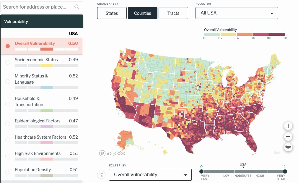
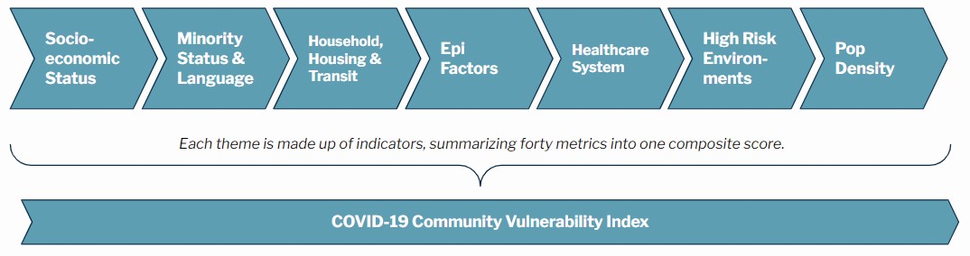
The seven themes (above) used for mapping the U.S. COVID-19 Community Vulnerability Index (CCVI). Those themes create a dashboard (below) showing community vulnerability to infections.
Most of us may not know it, but the birth of GIS was spurred by a health crisis that happened more than 100 years ago. In 1854, British doctor John Snow was the first person to ever draw a map that helped link cholera deaths to several water pumps in London, marking the beginning of spatial analysis as a problem-solving tool in public health. So could this era’s COVID-19 health crisis lead to another golden age for GIS?
That might be the case if the booming demand for COVID-related mapped data is an indicator. Last year, tech-savvy geographers in confinement were busy designing and launching mapping dashboards as people were concerned to know if the coronavirus has reached their neighborhoods. These mapping tools became so popular during the pandemic that Esri suggested in an article that 2020 could be the year of dashboards.
Serving as a kind of oracle for anyone who would like to make sense of the health situation, several more COVID-19 mapping dashboards started to surface on the Internet. One of them was from the organization where Stewart works.
Surgo Ventures is a nonprofit organization that focuses on “solving health and social problems with precision by leveraging the power of data science, behavioral science, and artificial intelligence.” It is a spinoff of Surgo Foundation, founded by Mala Gaonkar and Sema Sgaier in 2015. With headquarters in Washington, D.C., and a hub in the U.K., the goal is to bring a customer-driven approach to global health.
“Being a small organization at the start of the pandemic, we were well-positioned to be agile in shifting our portfolio to focus almost exclusively on COVID-19,” says Stewart.
And that they did. In April 2020, Surgo Ventures created its initial geospatial tool, the COVID-19 Community Vulnerability Index (CCVI), a mapping dashboard that locates susceptibilities in populations that would be amplified by the pandemic.
“The CCVI is the first Surgo tool that subsequently became the cornerstone of our COVID portfolio,” says Stewart. “It was built to assess the expected negative impact of a COVID-19 outbreak for every state, county, and census tract in the United States, allowing us to pinpoint our response precisely to where communities are vulnerable so we can determine how to best support them.”
While the pandemic spread rapidly across the United States, with hotspots of cases emerging in diverse communities within New York, Michigan, Florida, Pennsylvania, and New Jersey areas, the organization quickly recognized that the impact of the disease would be felt and mitigated differently by communities across the country.
In order to be able to develop an appropriate response to the pandemic, communities that are vulnerable to COVID must be identified in advance. Hence, the CCVI was designed to help leaders at the national, state, and local levels as they search for detailed and localized population data.
Critical to the development of the CCVI is GIS. “Before we can attempt to answer why there are disparities in COVID-19 related outcomes, we first must understand where inequities exist,” explains Stewart. As a senior research scientist at Surgo Ventures, he leads the company’s initiatives in the realm of geospatial analytics by combining GIS and AI technologies to transform data into visual and actionable information.
“Having a geospatial component to the data transforms complex data into easily digestible information.”
Crunching COVID data
At the same time that Surgo Ventures was developing the CCVI, other organizations were doing their part in the global goodwill effort to track the disease, mostly by way of dashboards. By presenting data in charts and graphs, and centering them around a map, dashboards have become the go-to visualization tool to display important COVID information from multiple data sources into a single and easily accessible platform.
Several private mapping companies flexed their geospatial muscle to chart the spread of coronavirus for free. One of the most popular ones at the height of the pandemic was by HERE Technologies, the location data and technology company based in the Netherlands. HERE created an interactive mapping console to show country-level COVID-19 cases using their proprietary geodatabases via the HERE Data Hub API. Although the HERE console is no longer updated, it is still available online.
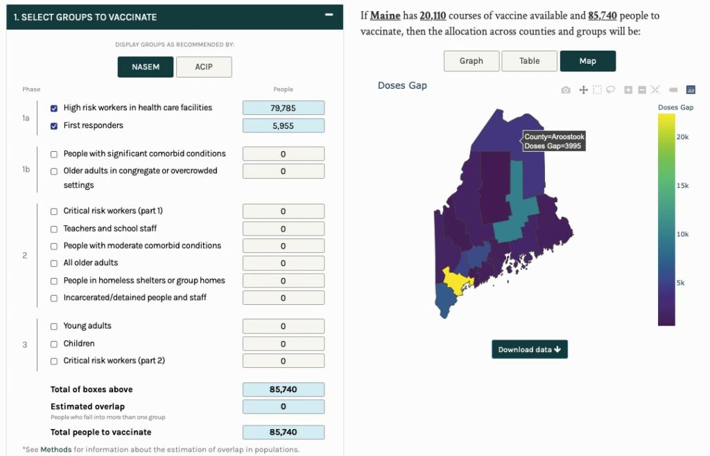
A view of the Vaccine Allocation Planner for Maine. The dashboard assists policymakers in all U.S. states to understand the quantity of priority populations at the county-level.
Microsoft, for its part, produced the COVID-19 Tracker in its Bing platform, complete with feature map layers from Tomtom. Unlike the Here platform, however, Bing’s COVID data is still updated in real-time, and even includes fresh data on vaccination counts. Meanwhile, its widget version allows users to embed the latest COVID information, such as outbreak maps, the latest case counts, and a chart displaying the spread of COVID over time, outside Bing’s platform.
Surgo’s CCVI tool is different from these mapping applications, however. For one, it simply does not count COVID cases. Instead, it combines various data sources to capture the different factors that contribute to a community’s vulnerability to COVID. These factors are divided into seven themes to capture the multi-dimensionality construct of vulnerability that can span from health issues to economic and social disadvantages at the neighborhood or census tract level.
“Mapped nationally at the state, county, and census tract levels, the CCVI can aid in COVID-19 planning and mitigation at a granular level,” says Stewart. The data presented in the CCVI makes each geographic unit a comparison metric with every other similar unit across the entire U.S. “For example, it allows for a census tract in Miami-Dade, Florida, to be compared to a census tract in rural Montana.”
Since its rollout, the CCVI has helped national agencies such as the Centers for Disease Control and Prevention (CDC) in exposing the underlying inequities that have existed across the U.S. prior to the start of the pandemic. Surgo also created a CCVI version for African countries.
“Not only has the CCVI proven valuable in mitigating some of the health-related effects by prioritizing personal protective equipment and testing resources to the most vulnerable populations, but it has also assisted in supporting quality of life,” says Stewart.
Other organizations have since benefited from Surgo’s mapping tool, allowing them to refine their work during the pandemic. For instance, information from the CCVI has helped Vanguard Charitable, a leading U.S. nonprofit organization, to improve their philanthropic operations.
“Immediately after the World Health Organization declared the COVID-19 pandemic in March of 2020, Vanguard Charitable recognized there would be an outstanding need for philanthropy during relief and recovery efforts,” says Magda Guillen Swanson, the organization’s research and development program manager.
To encourage generous giving, Swanson began considering what more Vanguard could do to connect donors with nonprofits. “For me, that meant looking for research and data-based solutions to drive informed and strategic giving,” she says.
Vanguard Charitable partnered with Surgo Ventures to develop NAVi, a charity locator mapping tool that displays data from CCVI, among others. “We developed the Nonprofit Aid Visualizer as a way to directly allow donors, both inside and outside of Vanguard Charitable, to easily search and identify nonprofits in the areas hardest hit by COVID-19,” says Swanson.
As an interactive mapping tool, NAVi displays three critical data points, including a community’s vulnerability to the pandemic as provided by the CCVI, COVID-19 incidence rates from the Johns Hopkins Coronavirus Resource Center, and detailed nonprofit profiles from GuideStar’s National Nonprofit Directory. The last dataset helps donors identify and support non-profit organizations.
“Backed with CCVI data, donors using the NAVi map were able to drill down to the exact zip codes where relief was most needed,” says Swanson. “Without Surgo’s deep data and understanding of social and health issues, this simply would not have been possible.”
Jabbing it right
When the situation in the U.S. moved on from counting COVID cases to vaccinating people, once again Surgo Ventures adapted its geospatial tools. The company knew local authorities had to make important decisions about how to distribute their allotted COVID-19 vaccine doses. So in October 2020, Stewart and his team created the Vaccine Allocation Planner, in collaboration with Ariadne Labs.
Beyond the conception and construction of these tools, Stewart and his team also developed and shared insights that assisted decision makers in utilizing the data from these tools in real-world ways.
The design of the Vaccine Allocation Planner takes into account the U.S. government’s recommendations for the equitable distribution of the COVID 19 vaccines. With this new geospatial tool, state and county decision makers can access region-specific data needed to distribute vaccines to different populations based on available vaccine doses, priority populations, and vulnerable communities.
After the Vaccine Allocation Planner went live, it was immediately used by many state public health departments to formulate their own vaccine distribution plans. A few weeks later, the tool became viral when it was picked up by the New York Times, which presented it in a visually-pleasing and user-friendly format that attracted the public’s attention.
“We at Surgo are very proud of the work that we have done over the course of the pandemic, but our main goal has always been to use data to inform policy,” says Stewart. “Having our work published in media outlets with national and global coverage ensures the visibility of our tools, and that our broader work is recognized.”
Aside from Surgo’s Vaccine Allocation Planner, several other companies have built their own vaccine-related dashboards. The most notable ones come from CARTO, one of the world’s leading location intelligence platform providers. Their vaccination status app, for example, is a visually impressive mapping project that dynamically represents how many people have received their vaccine jabs in the U.S. They have other COVID-19 tools that use mapping technologies in combatting the pandemic.
For example, CARTO’s work in Spain has helped address the problem of transporting the coronavirus vaccines along the country’s cold-chain transportation network. By using a combination of cluster analysis, spatial aggregation techniques, and linear optimization models, they mapped how to improve the delivery distribution of the vaccines to reach people while incurring significant savings in fuel, fleet size, and time. For a big country
where towns are spread out across the Iberian Peninsula, Spain is now one of the leading places with the most number of vaccinated people in Europe.
Geospatial tech inside
The common denominator among all these COVID-mapping tools is their strong geospatial component, which allows data to be analyzed and visualized in a dashboard format.
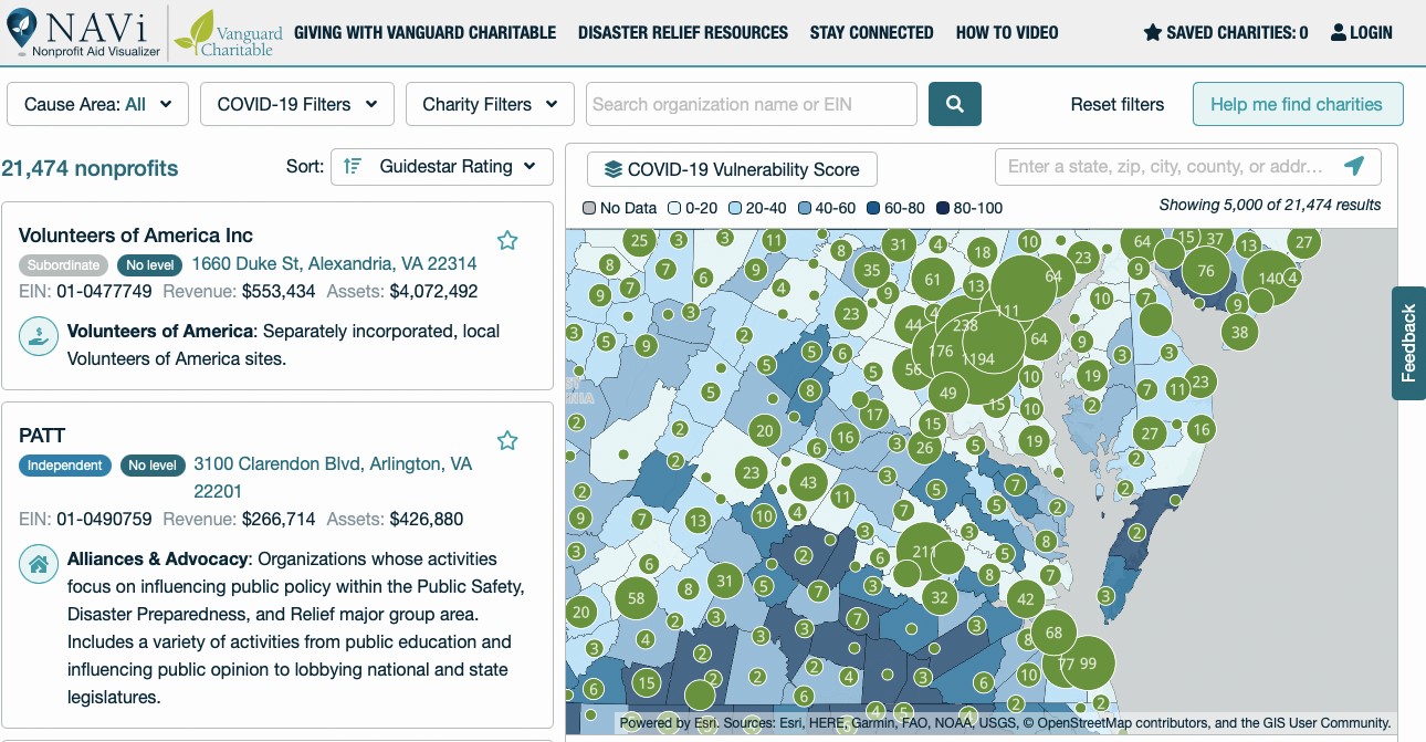
The Nonprofit Aid Visualizer (NAVi) dashboard of Vanguard Charitable connects donors with local nonprofit groups in areas hardest hit by COVID-19.
“Mapping visualizations are invaluable since they lead to operational insights that enhance data-driven decisions about mitigation efforts to eradicate COVID-19,” says Stewart.
The Surgo pandemic tools used geospatial-specific software such as ArcGIS, QGIS, and Mapbox solely for the purposes of visualization, while coding was entirely done in the R programming language. “We chose to code in R for purposes of reproducibility among colleagues.”
For the front-facing dashboards, Stewart’s team built them using Vue+ Mapbox+D3. And to save space and loading time, some of their tools used GeoJSON files that are converted to protocol buffer.
“Protocol buffers are Google’s language-neutral, platform-neutral, extensible mechanism for serializing structured data—think XML, but smaller, faster, and simpler,” says Stewart. “You define how you want your data to be structured once, then you can use special generated source code to easily write and read your structured data to and from a variety of data streams and using a variety of languages.”
Future-proofing with GIS
Given how much geospatial tech has been extensively used during this pandemic, could GIS become even more useful in future pandemic events?
According to Stewart, while GIS is currently in the news for mapping a variety of coronavirus-related issues, the technology isn’t limited to any one field. “From healthcare to civil engineering and national security to business, GIS is critical to a wide variety of industries and decisions,” he explains.
What’s important is data and their availability. “Data sets are increasingly available online and accessible to more people across the globe,” says Stewart. “This opens up unlimited chances for collaboration, which is key to understanding local, national, and global challenges as well as their solutions.”
Stewart also rightly points out that any user could now plug any publicly available online health data to maps and view the results at any scale. “In addition to their accessibility, these online tools also help create a comprehensive story of an issue, serving as a hub of information.”
But ultimately, all things must come to an end, and like any other technological products, mapping dashboards as information hubs will eventually reach the final point of their useful lifespan.
“We all hope to see a day when this vital service is no longer needed,” says Gardner of the Johns Hopkins COVID-19 tracker. “But until then we remain steadfast in our commitment to open data and providing the world with the most accurate and up-to-date information on this pandemic.”
Now that we are more than a year into the pandemic, Stewart believes that this health crisis has exposed many weaknesses in our healthcare systems. Geospatial technology might provide the means to resolve this.
“By leveraging the right data with the right geospatial tools, we can help to highlight those gaps and work toward fixing them,” he says. “I encourage everyone to stay curious and continue to explore new ways of solving problems. It is only through collaboration and thoughtfulness that we will be able to one day get back to normal.”