A few years ago, John Nelson was relatively unknown in the public eye, but in the last year he has gained attention through work he’s been doing with Esri GIS software.
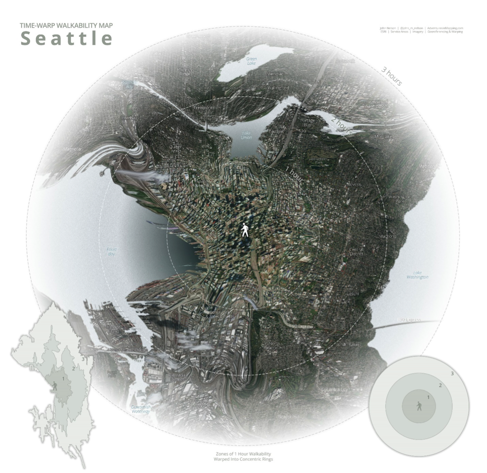
Who would have thought you could recreate the Lord of the Rings maps or simulate paper or watercolors using Esri GIS? Theses are just some of the cartographic pieces John has created of late.
I caught up with him near the Abbey Road studios in London for xyHt.
ND: What is your role at Esri?
JN: That’s a great question. Don’t tell anybody this, but on the record, I get to make maps, have fun, explore data, experiment with cartographic techniques, use Pro, in weird, sometimes useful ways, and then I have the privilege of writing up what my process was and how it may or may not be useful for folks, and then give them the option to try it out for themselves. So, hopefully they see some of the things that I do, and they’re inspired to try it out.
Now you’ve got people engaged with a geographic phenomenon and the process of creating maps, which is wonderland for me, and more and more my role is becoming kind of an ambassador for all of the amazing stuff that’s in the Living Atlas just waiting to be mapped. The cool mapping capabilities of Pro and ArcGIS Online are just beginning to be realized by the greater GIS community. So, whipping up some enthusiasm about what’s possible.
ND: What is it that you do?
JN: The short answer to that would be having fun, I guess. I’m a professional fun-haver.
ND: What did you do before Esri?
JN: Before [Esri] I worked for a software company in Lansing, Michigan, and we were an evolving company, as any small software companies are in a midsize market. We started out doing general geographic visualization for folks online. So, it was all web-based, and it was a mix of raster-based maps with vector data on top, which was pretty revolutionary in 2004. They got a patent for it, actually.
And then we kind of migrated into the dashboard area, so business intelligence, general location intelligence, and then it migrated as our customers grew in size and their requirements grew in scope. It grew into an asset-tracking and risk visualization tool.
We would build systems that tracked employees and assets, in general things that large organizations had a mandate to protect and be aware of. We would visualize those in the context of risk, like terrorism events or weather events or seismic events or anything that might cause a disruption to health and safety or business, and we would do a time and geographic proximity detection on those things and then alert the people who are stakeholders, who are in a position to respond, if there was something they needed to know about.
The goal was to have a more proactive way of knowing if your assets were in trouble—if people that were in your care were in trouble, rather than kind of seeing it on the news and then calling somebody and asking if folks needed help.
ND: So more analysis, rather than visualization?
JN: It was an awful lot of analysis that was happening behind the scenes via algorithms and spatial proximity and time proximity and that sort of thing, but ultimately it was a visual product, right? Because that’s what people are responding to. They’re seeing a map, they’re seeing where the people are, they’re seeing where their risks are, and they’re reacting to that. So, any alert that went out to our customers would include a map with their assets, with the risk and the description of the consequence of those two things, but over time we kind of drifted away from the purely geographic, purely data visualization aspect of that work, and I felt an itch that wasn’t necessarily being scratched there.
So I would make maps on the side in my spare time and do data visualization when I thought nobody was looking, and I’d put them on a blog. And some of those got kind of popular, and over time it was a more sanctioned sort of thing that I did, but I was kind of moving away from that core product and moving back towards data visualization and geographic visualization and cartography in particular, which was my background in university. So, it just felt like a good fit, and when the opportunity came to work for [Esri] I couldn’t say no.
So, Dr. [Ken Field], I sent him an email and said, “Hey Ken, if you ever see anything that looks like it might be a good fit, you know, I wouldn’t mind if you whispered in my ear or sent me a link and give me a heads up or something. He really took that to heart and kind of fostered that move.
ND: Even though you’re not British and you’re not from Nottingham.
JN: Even though I’m not from Nottingham.
ND: Thinking about some of the really nice cartography that you’ve done—or styles should I say—recently: What has inspired you? What’s the inspiration?
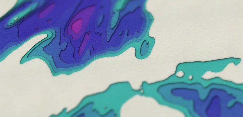
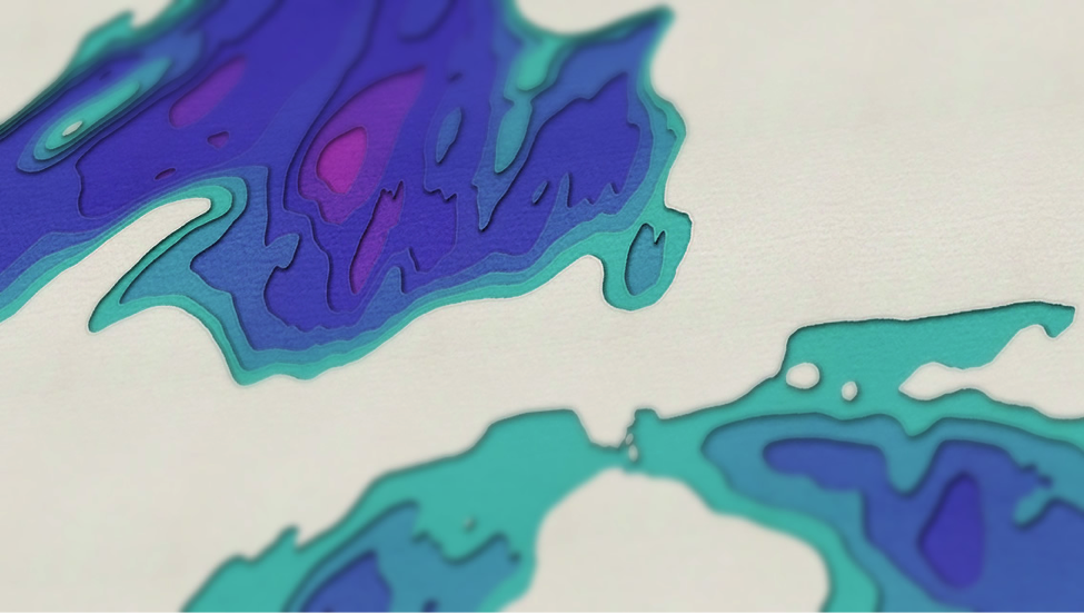
JN: A lot of them have come from looking at works that cartographers from the past have done that have a rich sense of texture and realness that I kind of longed for in the digital environment. What I like to do is pull those textures into the digital environment and kind of bring back that sense of tactile response for people when they look at a map. It looks like it might smell like paper and they might want to touch it. I like that. I think it’s great.
I didn’t even know about styles in ArcGIS until Edie Punt told me less than a year ago. I was making these maps, and she said, “You know, you can save this as a style and just apply it to other data sets.” I had no idea about that. So, ever since she said that, and this is a direct quote from Edie Punt, she said, “Styles are your friend.”
I didn’t really realize how right she was at the time, but they’ve been a good friend to me because it’s something that you can share. So, like never before, now I can create a map, save that map style as just a single file and throw it on the internet, and users can download that and start applying it like a rubber stamp to their own datasets and start engaging in all kinds of cool map-making adventures that they may not have done otherwise.
Let’s just say it’s really rewarding. It’s cool to see people take a style and say, “Here’s a map I made using that style.” I love it. That’s great.
ND: Could you talk me through the process of how you think about the style that you want to create? How will you come about developing that or how will you turn it into a style? I mean, do you plan? What’s the process?
JN: It varies a lot, but most of it is organic. Most of it has to do with whatever style I’ve worked on previously, and then I see people’s comments and reactions to that style, and invariably I’m inspired to take another direction and jump over to something else.
Now, occasionally, there’ll be a new great new dataset that hits the Living Atlas, like really amazing elevation data of Antarctica, for example, or moving glacier data. So, the folks from the Living Atlas will show me this data and I’ll be like, “Wow, this is amazing,” and I’ll play with it and try to come up with ways that are visually appealing to help spread the word that this stuff is available for them to use free.
But sometimes I’ve got a visual idea in mind in want of the data. Right? So, it can go either way.
ND: If you couldn’t make maps, what would you do?
JN: That’s a good question. I always thought if I was not a cartographer or geographer, I would have been an architect. But the more realistic side of me realizes that probably wouldn’t happen just because I could never get the math courses. [laughter] I’d be a failed architect. But I think the reasons for that come from the same part inside me that wants to make something, that wants to build something, that wants to see the results of a creative urge.
ND: Are you allowed to tell me what you’re currently working on?
JN: The more maps I make, the more opportunities there are to share that with other people. I’ve been really enjoying doing that. So, the process of showing what’s possible and kind of encouraging people to give it a shot and be a little bit adventurous in that way. It’s been a lot of fun.
ND: Are there any maps that you’d like to make? That you’ve got in your mind, that you really want to make but you just haven’t been able to do it yet?
JN: I want to make a great map of Antarctic elevation. I want to do something interesting with that. That’s my hope. So, when I head home in the next week, I think that’s largely what my attention will be focused on.
ND: When we met in San Diego, you told me you weren’t a cartographer. Has that changed?
JN: Did I say that?
ND: You did.
JN: But you didn’t record it?
ND: No. [laughter].
JN: Well, I don’t know if I would say that now. I mean, I go around saying if you have a hand in the making of maps, then you can consider yourself as a cartographer. If that suits you then go for it. I think a lot of people are intimidated by the word because it sounds so specialized and formal and stodgy and maybe a little bit unapproachable. But there are lots of people out there doing GIS and doing analysis and geoprocessing and creating maps. They may not consider themselves to be a cartographer, but if they’re making a map, then they are cartographer.