Do you know where your control really is?
Editor’s note: The earth moves, even if we do not want it to – or we do not perceive that it does. If you are surveyor working in any part of the country your work will be subject to some degree of subsidence or deformation – be that due to plate tectonics or other localized geophysical influences. But surveyors in some parts of the country, like California are on a constant roller coaster ride. California surveyor Scott Martin shares his research and insights into the subject.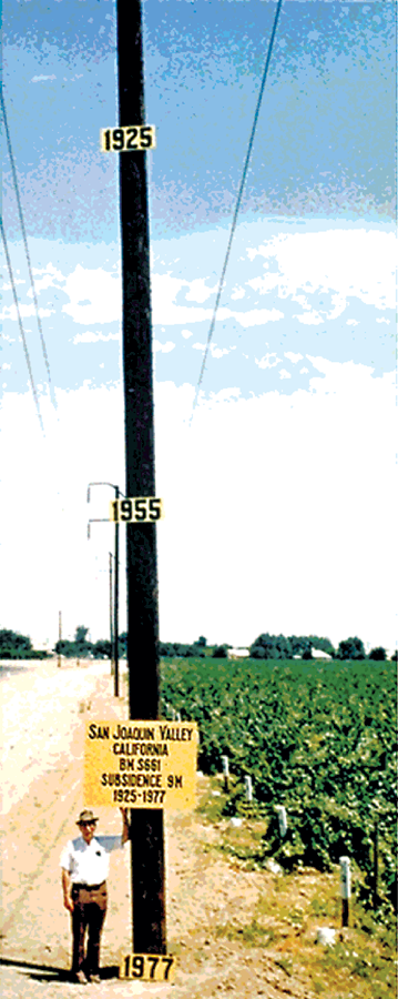
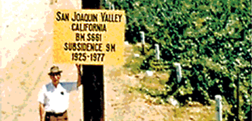
Dr. Joseph Poland stands beside a utility pole showing 28 feet of subsidence.
Sink and Slide
If you are a land surveyor working in California and base your work on the current reference systems of NAD83 and NAVD88, you know, or should know, that California is constantly on the move. Essentially points in the ground are constantly moving in a northwesterly direction at various rates of up to around 5 cm/year in some coastal locations. In the summer 2013, issue of the California Surveyor (Issue #174) I wrote an article about this horizontal displacement and how to use the NGS tool Horizontal Time Displacement tool (HTDP) to model positions across time. In this article I will address movement in the vertical component, for which no modeling equivalent of HTDP exists.
Land surface subsidence has been an ongoing issue in the San Joaquin Valley, according to over 100 years of reports on the topic. Most of you have probably seen the famous picture (Figure 1) of USGS employee Dr. Joseph Poland standing beside a utility pole with a 1925 sign high up the pole, a 1955 sign about half way down, and a 1977 sign sitting on the ground. The photograph dramatically and effectively depicts roughly 28 feet of total subsidence at that location, which is on the westerly side of the valley along Panoche Avenue, east of I-5.
As a point of clarification, the sign Dr. Poland is holding says this is the change detected in BM S661. However, according to the NGS datasheet for that bench mark (PID GU0103), it was not set until 1942. I have been told by reliable sources at the USGS that the pre-1942 subsidence, back to 1925, was a linear estimate.
While that’s an eye-opening photograph, no doubt, unless you work in or try to push water through that area, you probably have never really considered subsidence a problem. If you work anywhere in the Sacramento or San Joaquin Valleys (and several other California valleys and basins), the California Delta, and even some coastal areas and where your work is dependent on accurate relative and absolute elevations, you might want to reconsider your ambivalence.
The construction of the California Aqueduct (by the State) and Central Valley Project (by the Feds) delivering surface water to the fertile, but dry agriculture lands of the SJV greatly arrested the extreme subsidence shown in the Poland photo. Although that area has moved down some since 1977, that particular spot has only subsided around 3-4 centimeters since 2008 according to USGS data.
However there are other areas in the SJV that appear to have subsided as much as 4 feet since 2008, possibly more. That is not a typo. Rates up to, or above, 1 foot/year have been verified in a few locations by independent methods. These “new” areas subsided very little, relatively speaking, during the period depicted in the Poland photo.
So what changed? Why is this happening? How far will these areas subside before they stop? These are perhaps well more than $64,000 questions.
Causes
We all know that California is now in its fourth year of an extreme drought, perhaps the worst of the last century. It would be easy, even logical, to blame the new subsidence areas on the drought. Because that same surface water from the State and Federal conveyance facilities that arrested the earlier subsidence has not been available, it has been augmented by increased groundwater pumping. The more water being sucked out of the ground, the more the land surface goes down, right? Well, sort of. Maybe.
It has been explained to me, by people much smarter than I, who are educated and work in the fields of geology and hydrology, that subsidence is not caused by droughts alone. It is caused by land use and geology. The rates can be drastically affected by drought or wet conditions, but if the correct underlying geology isn’t present, and if the surface land use isn’t “thirsty” and being quenched by groundwater, subsidence at any significant rate is minimized or not even possible.
The area of the highest detected rate of subsidence since 2008, often referred to as the “El Nido Bowl,” dropped about 2 feet from January 2008 to January 2010, yet the drought hadn’t even started. Clearly, the drought didn’t “cause” that 2 foot deep bowl to develop. The reality is that the land use in that area changed around 2006, from what I have been told, into crops requiring much more water. Therefore, the localized groundwater pumping increased substantially. So the change in land use, coupled with the geological conditions prone to subsidence triggered the process. The subsequent drought certainly has not helped.
I don’t want to get into a discussion about how to stop or control subsidence or groundwater pumping, because those topics are wrought with political and regulatory solutions, economic impacts, and heated opinions. What I do want to do is talk about how we, as surveyors, can and should manage the effects of it, especially with regards to selecting and maintaining our primary survey control.
Reference Stations
In the time before CORS, we relied on passive survey marks in the ground as our “control,” whether horizontal, vertical, or both. Many surveyors likely still rely heavily on passive marks and probably have some “favorites” they have revisited and used multiple times in the area where they practice. How many of you have ever done anything to check the current elevation of a bench mark that has a published elevation that was established 30 or more years ago? Do you simply grab the published elevation as “good” and go, say for a Flood Elevation Certificate? After all, it is published by NGS, the keepers of the National Spatial Reference System (NSRS), so the elevation is golden, correct? That could be a very costly assumption and reliance.
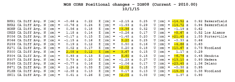
Figure 2
I recently heard a question of the NGS asking how many CORS stations have current positions that differ from their published 2010.00 positions by more than the NGS general tolerance window of 2 cm horizontally and/or 4 cm vertically? The answer provided was 77 stations (out of approximately 2,150).
I followed up to find out how many of the 77 are in California and how far “out” they are. Giovanni Sella of the NGS promptly supplied me the requested information (Figure 2). There are seven CORS stations (out of about 250 in California) that currently have an ellipsoid height more than 10 centimeters lower than the published ellipsoid height and the worst one is almost ¾ of a foot lower than what users believe it to be.
That’s what the NGS supplied information says, but is it correct? How is a user supposed to know these things? If the published positions for CORS stations aren’t accurate, what is left to rely on? What research resources are available to users prior to deciding to select and use a specific CORS? How can they evaluate other or Continuous GPS/GNSS (CGPS) stations that aren’t National CORS, but also those that are part of the California Spatial Reference Network (comprised of more than 800 active stations) to decide which to hold as control?
I can think of at least two resources that all surveyors should be aware of when considering using CORS/CGPS stations as control. Especially when those stations are located on the affected valley floors, but likely a good practice for any region.
Geodetic Resources
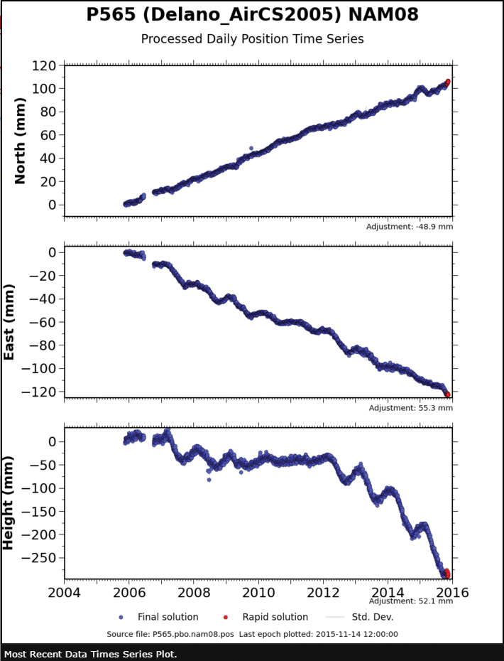
Figure 3
Time Series Plots. More than ¾ of the CGPS stations in California are owned and operated by UNAVCO/PBO (The Plate Boundary Observatory of the Earthscope project funded by the National Science Foundation). For each of those stations, time series positional plots are available on the PBO website: http://pbo.unavco.org/
Let’s take a look at the time series plot for station P565, the one on the NGS list with an ellipsoid height 23 cm lower than published (2010.00 epoch).
- Go to “Network Information” on the PBO site,
- Go to GPS Map,
- Select P565 from the station selection tool just above the map, I get to lots of information about station P565. One of the images I immediately see is titled Station Position
- Click on it see what I get.
- Houston, we have a problem!
According to this plot (Figure 3), the height has dropped somewhere in the vicinity of 250 mm since 2010, so pretty close to the -23.45 cm estimate provided by NGS. The drift in the north and east plots are consistent with what is expected and what HTDP is able to effectively model, but there is no model for a rapid vertical drop like shown in this time series.
Hope you didn’t let your single GPS unit cook on a set point (although you were careful to break setup and do two sessions separated in time for redundancy), then downloaded the RINEX file for P565, held its published position and post-processed to get values for your new point to do that FEC… Of course, that would be poor practice under any circumstances, but in the era of black box surveying, I have seen worse.
Figure 4 is the 2015 time series plot for P565 from the NGS website. You will see that it is displayed differently, as daily position minus published, but it also shows the station being nearly 25 centimeters lower than published.
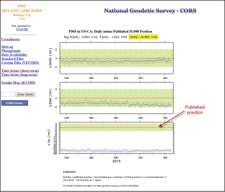
Figure 4
These time series plots are available for all PBO stations, and all CORS stations.
Let’s look at another on the NGS CORS list – P271, in the Woodland area (Figure 5).
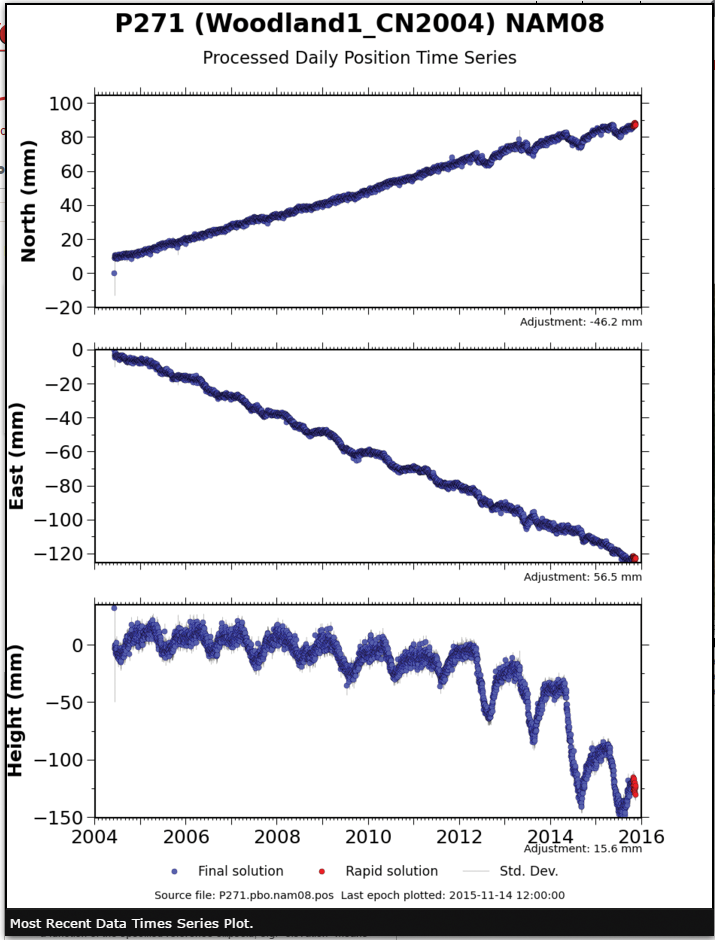
Figure 5
Note there is an approximate 110 mm drop in height since 2010. The NGS info estimated -10.67 cm. So, the time series plots are a valuable resource for checking the stability of the station, or lack thereof.
Is there another way of obtaining a more refined position for a point in time, rather than “eyeballing” off a squiggly and fuzzy time series plot? I’m glad you asked.
Check out the Scripps Epoch Coordinate Tool and Online Resource, or SECTOR. SECTOR is a product provided by the Scripps Orbital and Permanent Array Center, or SOPAC, and can be accessed here: http://sopac.ucsd.edu/sector.shtml It can also be accessed through the California Spatial Reference Center’s website under Resources/Coordinates located here: http://csrc.ucsd.edu/#.
Using SECTOR, I performed the calculation for each January 1 since the date of the published value, and also included November 1, 2015 (2015.8356). Figure 6 shows the results.
Well, I’ll be, there is that pesky 24 cm again! As fast as it is moving downward now, it will likely be over 30 cm by this time next year. I checked the current NGS datasheet for station P565 (PID DM6183) and the published 2010.00 NAD83 ellipsoid height is 63.704 m, which agrees with SECTOR within 2.3 mm.
These are some of the resources available to determine if your chosen CORS/CGPS station is still where the last published position states it is, or not. If not, by how much? We are seeing alarming rates of subsidence in areas of California where historically it has not been a major issue. How far down will these “new” areas go? Will it be approaching 30 feet like in the Joe Poland photograph? Will there be other new areas, almost suddenly appear, moving downward rapidly?
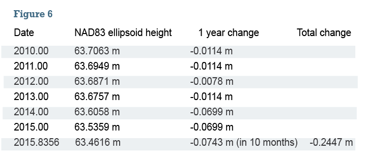
Figure 6
Real World Consequences
The USGS recently put up a website depicting lots of different information about Central Valley drought indicators and historical (and recent) subsidence information. This is another resource that should be utilized when planning survey control in any areas that could possibly be prone to subsidence. It can be accessed here: http://ca.water.usgs.gov/land_subsidence/central-valley-subsidence-data.html
Various information can be toggled on and off using the “Layers” tab in the upper right of the map area.
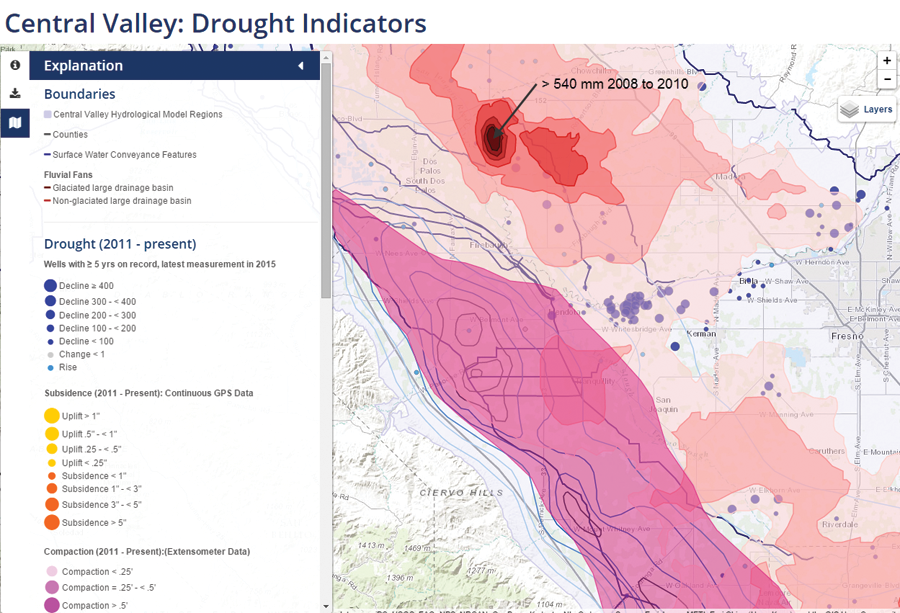
Figure 7
Figure 7 shows a screen shot of the El Nido bowl that developed between 2008 and 2010. That dark red color in the center of the bowl indicates at least 540 mm of subsidence during that time period. As one can quickly see, the mapped subsidence is differential over fairly small areas in some cases, so applying the logic that “it is all sinking together, so it doesn’t matter” isn’t necessarily valid depending on the size of your project area.
Consequences can be substantial. For example, the California High Speed Rail alignment is going through areas of the most recent, rapid subsidence. It is a problem, for sure, of unknown future magnitude. It’s going to present challenges with the mapping, design, construction, and maintenance. If areas along the alignment eventually look something like the Joe Poland photo (shown earlier in this article), it is going to be a major problem.
So, yes, these could be much, much higher than $64,000 questions (start adding zeroes). Time will tell. In the meantime, practice due diligence. Just because something has a published position doesn’t mean it is still in that location. Maybe not by a lot.