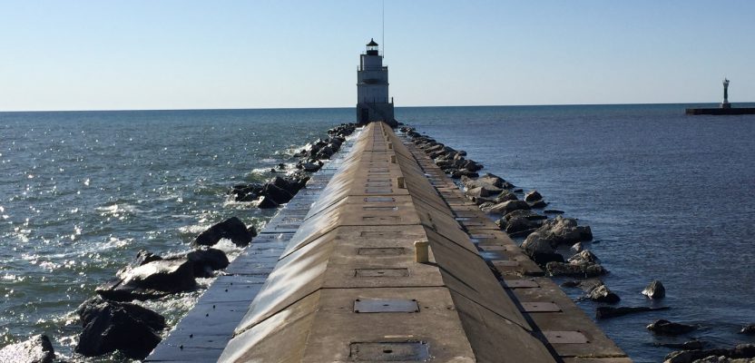
Image above: The author’s view of Lake Michigan as he walked toward the lighthouse at Manitowoc.
Not long ago, obtaining data for a surveying or GIS-based project was an arduous task. Because great time and effort was involved with either creating your own data or obtaining data that someone else created, you had to think carefully about the quality of the data that would go into your project.
While it can still be cumbersome to obtain data at specific scales for specific areas or to gather data in the field, cloud-based data services, crowd-sourced maps and databases, and real-time streaming make it easy for anyone to obtain vast amounts of data in a short amount of time.
In such an environment where so much data is available, is data quality still of concern? I believe that yes, data quality does matter. In fact, because it is so easy to obtain data nowadays, and with the advent of crowdsourcing and cloud-based GIS, I submit that data-quality considerations actually matter now more than ever.
Two reasons point to why geospatial data quality matters. First, despite the plethora of maps all around us, maps still carry an air of authenticity—they tend to be believed. Even fun stories that circulate online—such as the one about the SS Warrimoo that supposedly was in two different days, months, years, seasons, and centuries, all on December 31, 1899 in the Pacific Ocean—tend to be believed, even when they stretch the limits of plausibility.
In this resulting ocean of good maps and bad maps, anyone in the field of surveying and GIS must be more diligent than ever to understand the data they are using and in producing maps and reports that are well documented and clear.
Second, it is helpful to remind our customers, clients, audience, and stakeholders that maps are not reality, but representations of reality.
Consider the deciduous-coniferous tree “line” depicted on most ecoregion maps in Wisconsin and Minnesota (Figure 1). Is it really a line, or is it more accurately thought of as a zone? How can this or other similar “lines” be cartographically portrayed so that people understand this concept?
Consider the following three practical examples of critical thinking in action.
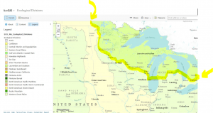
The coniferous-deciduous tree “line” in the USA and Canada.
Be Critical of Data, Even When It’s Your Own
Thanks to mobile field technologies, anyone can create spatial data (even from a smartphone) and upload it into the GIS cloud for anyone to use. This has led to incredibly useful collaborations such as OpenStreetMap, but this ease of data-creation means that caution must be employed.
For example, examine this map (Figure 2) that I created using MotionX-GPS on an iPhone and mapped using ArcGIS Online that follows my track around Kendrick Reservoir in Colorado. This map is symbolized on the time of collection, from yellow to blue dots as time passed.
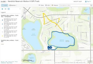
A track gathered with a smartphone fitness app and mapped in ArcGIS Online.
Note the section to the northwest of the reservoir, generated when the smartphone was just turned on. This shows my track erroneously not following streets or sidewalk. It was not until ten minutes had elapsed—as the number of satellites, Wi-Fi hotspots, and cell phone towers rose and could be triangulated against—when the positional accuracy improved until the track points began to be 1 meter off of my ground position.
Misleading Data—Mapping Lyme Disease
My colleague and I had taught with a data set and map of Lyme disease cases from 1992 to 1998 by town in Rhode Island, starting with an Excel spreadsheet and using Esri Maps for Office to map and publish the data to ArcGIS Online (Figure 3).
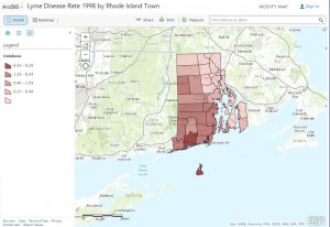
Rhode Island Towns Lyme Disease Rate – 1998.
When we began to update the data with information from 1999 to the present with data from the Rhode Island Department of Health, we noticed that the disease rates had plummeted. It almost seemed too good to be true.
Being critical of the data, we called the department, who told us that Lyme disease surveillance is time- and resource-intensive. During the 1980s and 1990s as funding and human-resource capacity allowed, the state ramped up surveillance activities, including robust outreach to healthcare providers. Prioritizing Lyme surveillance allowed the state to obtain detailed clinical information for a large number of cases and classify them appropriately.
The decrease observed in the 2004-2005 case counts was due to personnel changes and a shift in strategy for Lyme surveillance. Resource and priority changes reduced their active provider follow-up. As a result, in the years since 2004 the state has been reporting fewer cases than in the past. They believe this decrease in cases is a result of changes to surveillance activities and not of a change in the incidence of disease in Rhode Island. Therefore, the situation was too good to be true!
If this isn’t the perfect example of “know your data,” I don’t know what is. If one didn’t know that surveillance activities had changed, an erroneous conclusion about the spatial and temporal patterns of Lyme disease would surely have occurred. Here and elsewhere, this kind of information typically doesn’t make it into standard metadata forms.
This is also a reminder that contacting the data provider is often the most helpful way of obtaining the inside scoop on how the data was gathered, even though it may sound “so 20th century.” And you can bet that we made sure this information was included in the metadata when we served this updated information.
Reflections on Resolution and Scale
After giving a presentation at the University of Wisconsin Milwaukee for GIS Day, I walked on the Lake Michigan pier at Manitowoc, recording my track as I went. When I mapped it, it appeared as though I had been walking on the water (Figure 4). Funny, but I don’t recall even getting wet!
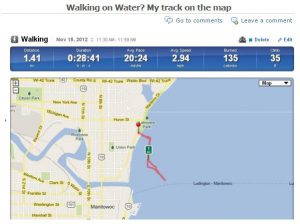
Walking on water? My track on a basemap with insufficient detail.
It comes down to paying close attention to your data, knowing its sources, and the importance of scale and resolution in any project involving maps or GIS. In my case, even if I scrolled in to a larger scale, the pier did not appear on the Runkeeper application’s basemap until a few years later. (It did originally, however, appear on the base map in ArcGIS Online.)
Today, while GIS tools allow us to instantly zoom to a very large scale, the data that you are examining might have been collected at a much smaller scale. If you are making decisions at 1:10,000 scale and your base data was collected at 1:50,000 scale, you’re treading on dangerous ground, or, one could say, you are “walking on water.”
With great opportunity comes great responsibility. As never before, we have a vast array of data at our fingertips, with powerful and easy-to-use tools and models with which to analyze it. Don’t get lulled into complacency and use a mapped data set just because it’s easily accessible or because the symbology looks sharp. Be sure to be critical of the data.
Furthermore, with the ability to publish your data in the cloud, embed your maps in web pages, or distribute them via communication tools such as Storymaps, thousands or millions of people could be looking at your maps and reports. By checking your data sources, your map is more likely to be on firmer scientific ground, and you are more likely to reduce any possible misinterpretation of your data.
Finally, practice what you preach about metadata. We all breathe a sigh of relief when the data we are seeking is well populated with metadata. But when you are publishing your own data, are you providing metadata so that others will breathe the same sigh of relief? For more information on the topic of data quality and related data issues such as crowdsourcing, copyright, location privacy, and data sources, see the book that Jill Clark and I wrote, entitled The GIS Guide to Public Domain Data, and the blog that we update weekly, Spatial Reserves.