
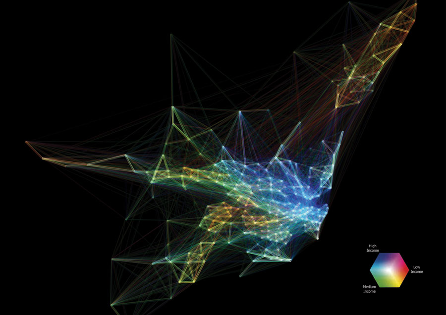
Between 2006 and 2011 a little fewer than 400,000 households (around a quarter of the total) moved at least once within the Sydney metropolitan area. While this figure is an under-count of total moves (many households may have moved more than once, and those moving into the city from elsewhere are not presented), mapping this sample sheds light on the spatial character of the city.
Here, Australian Bureau of Statistics census data has been mapped using the QGIS package. Close to 15,000 aggregated interactions between 279 unique locations have been joined together using the Well Known Text (WKT) format for data handling. Household incomes have been aggregated into three categories and attributed with unique colors. Using QGIS’s data-defined formatting capabilities, smaller-scale moves are fainter and larger-scale aggregates more dominant. The unique colors combine to form composite colors where shared routes of mobility are encountered.
Various localized patterns of mobility with shared income profiles (and, indeed, income mixing) can be discerned as shaping the underlying demographic structure of Sydney. While connections between all areas of the city are evident, those that are local in nature are considerably stronger, thus conforming to Tobler’s first law of geography: “Everything is related to everything else, but near things are more related than distant things.”
Research funded by the Australian Research Council.